Building a design system with AI and UX research
Testing concepts with 61 teachers, then turning the winner into a 30-component design system with Claude and Storybook

Skills
Design System
Concept Testing
AI-Assisted Workflow
Info
K–12 Literacy Platform
Product Team
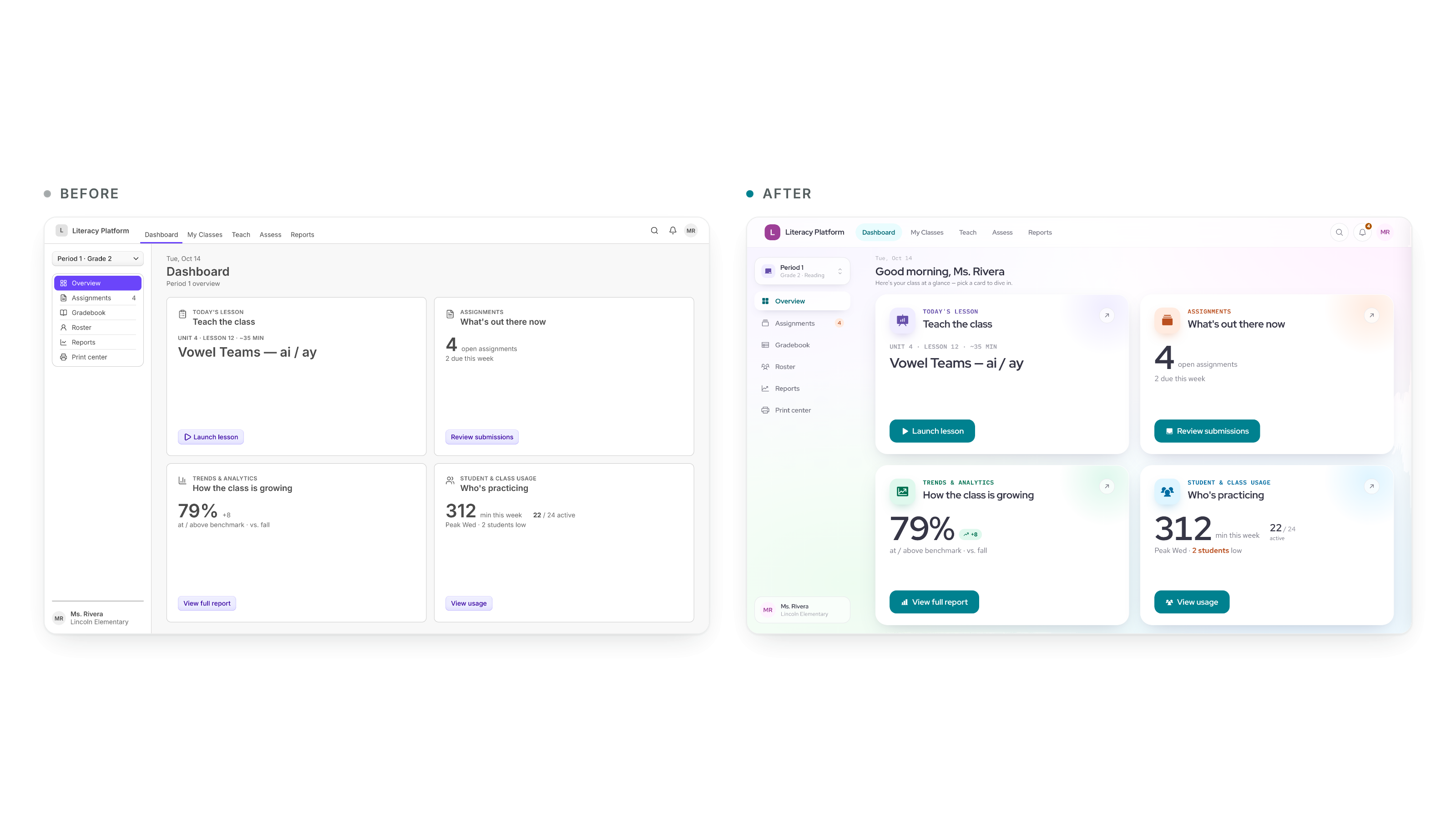
Our K–12 literacy platform shipped its 2.0 release with a generic placeholder UI. As the sole product designer, I tested four visual directions with 61 teachers, then used Claude to turn the winner into a 30-component design system in Storybook, restyled in three weeks.
Role: Sole product designer · Team: Senior full-stack engineer, UX researcher, product · Tools: Claude Code, Claude Design, Storybook, React Aria, Figma
Problem
The placeholder UI was a deliberate trade so engineering could focus on the platform underneath. But the interface is often a district's first proof of quality, and an undifferentiated look was eroding trust. One teacher wrote online that a major competitor's product "reminds me of a 90s game." Polish and trust were open territory.
The work came with firm constraints:
Restyle, not relayout – Scope was tokens and components. New layouts, IA, and workflows were out.
Three audiences, two viewing distances – Teachers need density. Students in K–3 and 6–8 need very different treatments. A projected classroom screen has to read from about 25 feet.
Accessibility is a floor – WCAG AA was not up for a vote.
The Challenge
How might we give the platform a look teachers trust at first glance, and make it buildable by one designer and one engineer?
Approach
1. Explore four directions, one dashboard
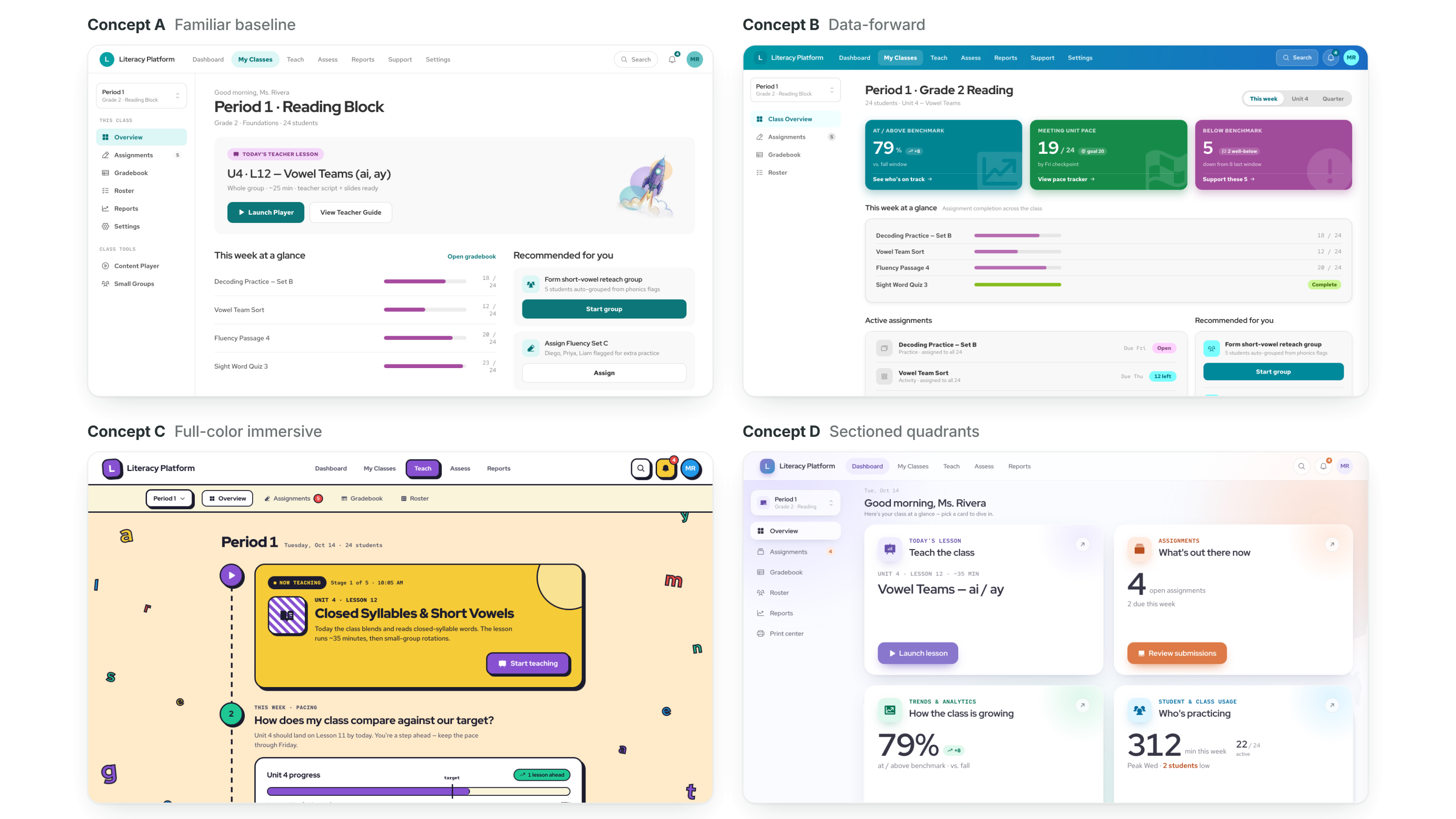
I rendered the same teacher dashboard four ways: Spacious, Playful, Editorial, and Dense. Layout stayed fixed so only the visual treatment varied. I scored each against four criteria: fit with our "less is more" principle, fit with the teacher persona, how well it scaled to other surfaces, and accessibility headroom. In stakeholder review I recommended Spacious as the base, folded in Playful's warmth, and set Dense aside for future admin views.
2. Test with teachers
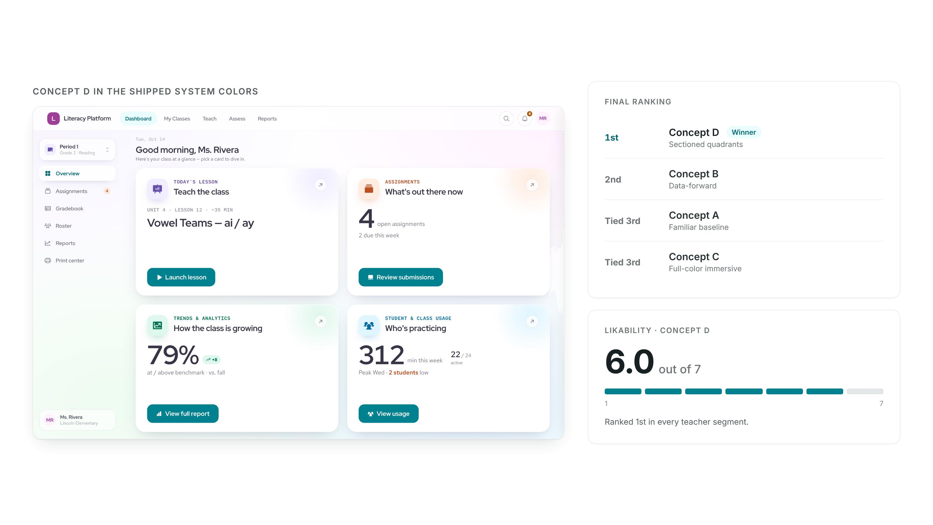
A stakeholder preference is a starting point, not a verdict. With our UX researcher, I ran an unmoderated test on UXtweak with 61 teachers: 34 who did not use our product and 27 who did, including special education and intervention teachers. Each teacher saw one concept for 5 seconds, rated it on nine scales mapped to our design principles, then ranked all four.
3. Turn the winner into decisions
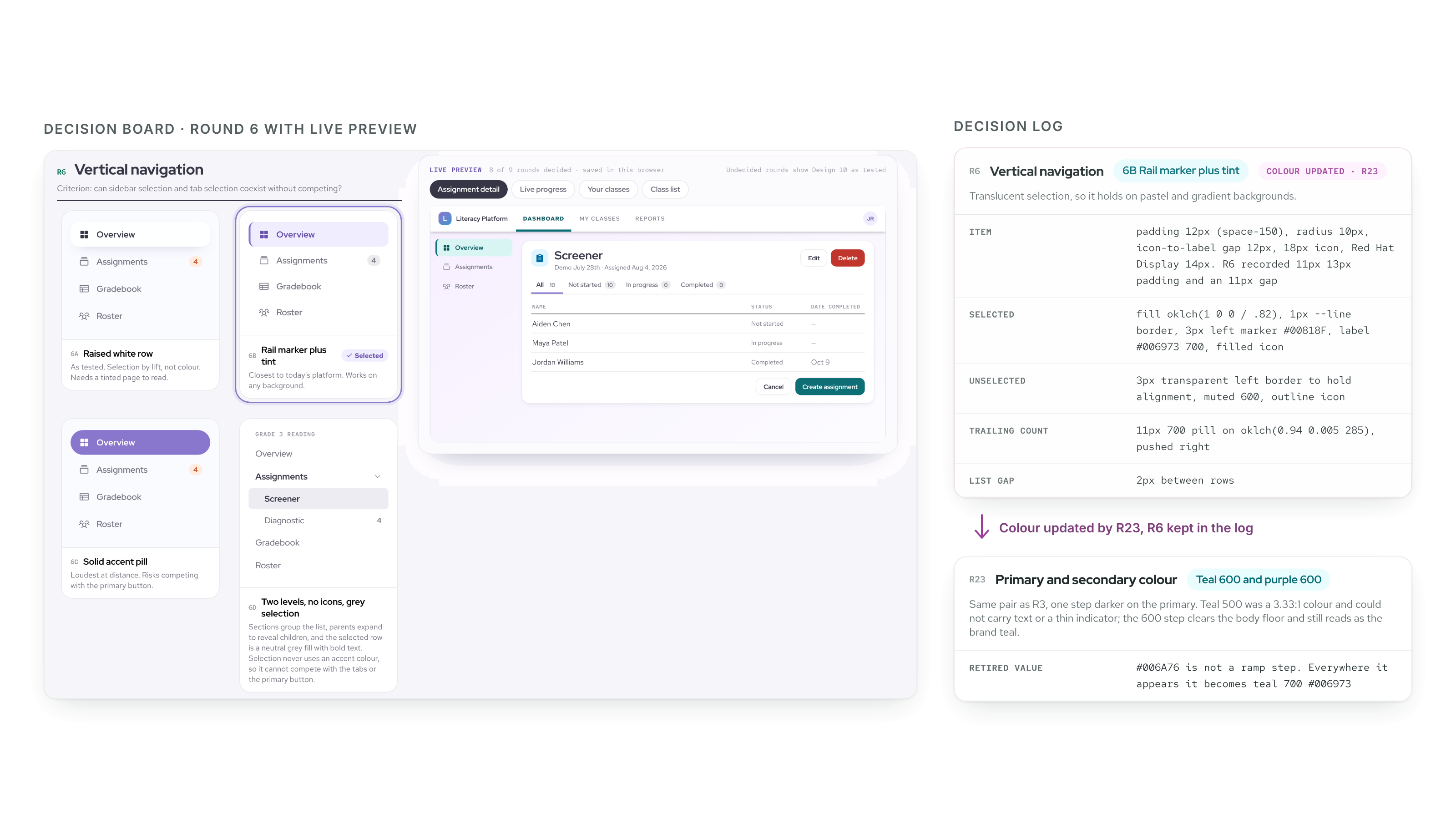
A winning concept is not yet a design system. I built a decision board of nine rounds, each showing the same real screen with one thing changed: background, cards, color, navigation, tabs, buttons, tables, and type. Every round had a criterion written for the classroom. Tiebreakers were agreed up front: projection legibility beats preference, WCAG AA is a floor, and lower engineering cost wins a true tie. I logged every round and marked replaced ones "superseded" instead of deleting them, so nobody re-argued a settled choice.
4. Build the system with Claude
I wrote the specs once: a design doc, a component restyle spec, and a semantic token spec, explicit enough for Claude Code agents to build from. Then each component went through the same loop:
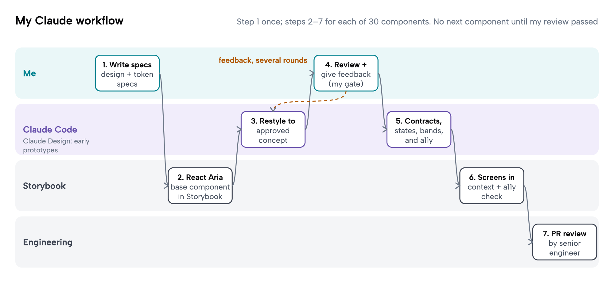
Start from a proven base – Each component began as a React Aria component in Storybook.
Restyle with agents, review as the gate – Claude Code restyled it to the approved concept. I gave feedback over multiple iterations and did not move on until the output was right.
Make it complete – Each component gained contracts, guidelines, and examples, and covered states, use cases, screen widths, grade bands, information density, and accessibility.
Judge it in context – I added full screens in Storybook, and used Claude Design for earlier prototyping.
Hand off as a PR – Every component went to my engineering partner, a senior full-stack engineer, for review.
Key Decisions
Adopt, don't derive. I took IBM Carbon's 9-step type ladder, 16px base, 4px grid, and focus width. A private scale would cost convergence and buy nothing.
Borrow behavior, decide identity. Interaction behavior comes from React Aria. Density, visual signature, and K–12 status color are ours.
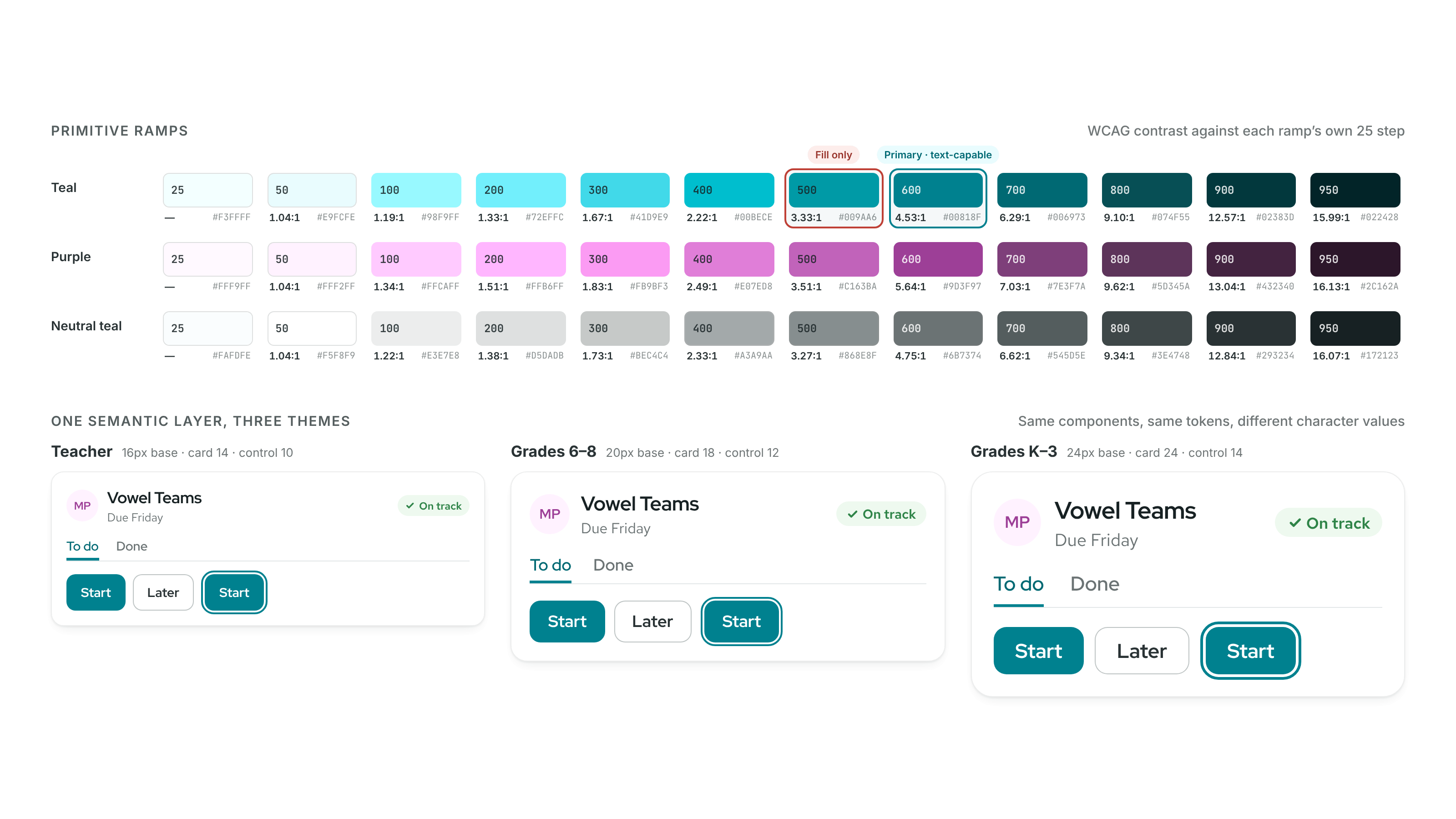
Darken the primary so it can carry text. Teal 500 reached only 3.33:1 and failed. Teal 600 clears 4.5:1, so the brand color can be used for text.
One color owns interaction. If it is the primary color, you can act on it. The secondary purple is identity only and never marks an action.
Presentation re-enters the type ladder. A blanket 2× scale gave way to four stage tokens. Minimum sizes are set by angular size: at 25 feet, 32px text is about 19 arc-minutes, which sets a real floor instead of a guess.
Radius follows grade band. Card radius steps down across bands (24, 18, 14), and buttons sit two steps below.
Output
A differentiated design system on one semantic token layer, shipped in Storybook:
Foundations – Nine OKLCH color ramps of 12 steps each, hue-derived neutrals, five elevation steps, and Carbon motion curves.
Themes – Teacher, and student for K–3 and 6–8, without forked components.
A presentation view that stays readable when projected to a whole class.
Components reference semantic tokens only, so a theme change flows through every component that uses it.
Outcome
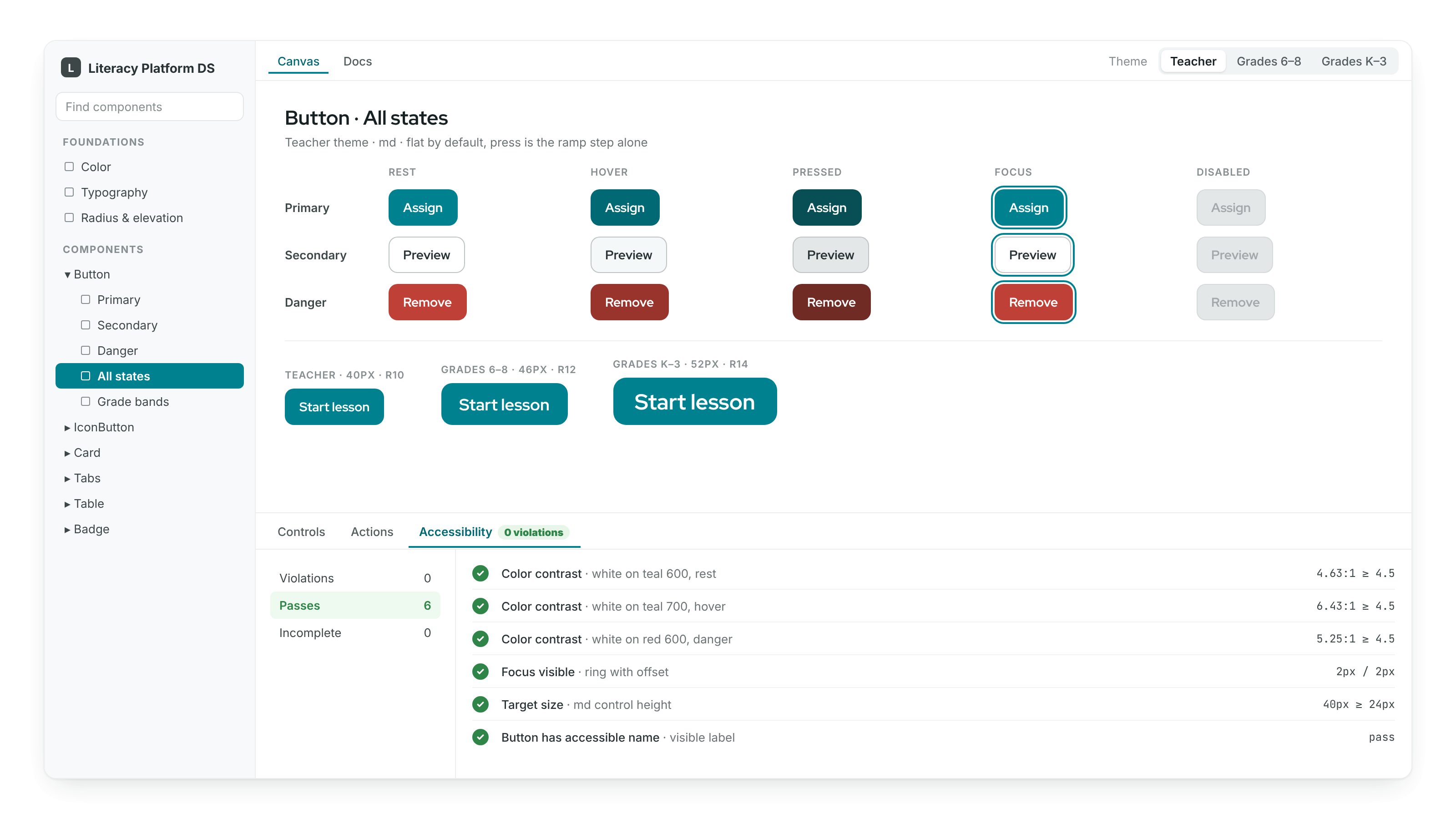
30 components and 18 screens in Storybook
The whole restyle took three weeks, including the specs, tokens, and screens. Once the foundations were in place, a component took about an hour with Claude, where building one by hand had taken about a day. Those are my own estimates, not a controlled measurement.
Ranked 1st in every teacher segment
The winning concept took first place overall, with grade level and subject teachers, and with intervention and special education teachers. It earned a likability score of 6.0 out of 7 after only five seconds, and 6.3 out of 7 for looking professional.
Accessibility built in
Storybook's accessibility check was running as I built. Text colors were solved to clear 4.5:1, and the projection floor was set by angular size, not taste.
The win was not a clean sweep. Intervention and special education teachers flagged a risk nobody had planned for: sensitive student scores showing on a projected screen. That finding started a dedicated persona effort for 6th to 8th grade intervention and special education teachers.
Key Takeaways
What I Learned
Evidence beats taste – Testing turned a preference debate into a decision I could defend.
Specs for agents are better specs for humans – Every rule had to be explicit, so nothing lived only in my head.
AI speeds up building, not judgment – My review at each component is what made the speed safe.
What I'd Do Differently
Recruit specialists as their own segment – Intervention and special education teachers evaluated everything through a stricter lens. I would plan for that from the start.
Test a student screen earlier – Every concept was teacher-side, which delayed grade-band decisions like the type scale.
Track coverage and accessibility from day one – I would set up measurement in Storybook before the first component, so the system's health is measured rather than assumed.
Final Thoughts
When teachers and districts have to trust a platform, the look is part of the product. Testing with 61 teachers made the decision easy to defend, and writing specs that agents could build from made the system fast to ship and easy to maintain.