Building a design system with AI and UX research
Testing four visual directions with 61 teachers to find a look they trust

Skills
Visual Design
Concept Testing
Design Systems
Info
Oct 1, 2026
Really Great Reading
Product Team
RGR 2.0 launched its first screens with a generic placeholder UI. As the sole product designer, I explored four visual directions and tested concepts with 61 teachers. One concept ranked first in every segment and became the basis of a new design system.
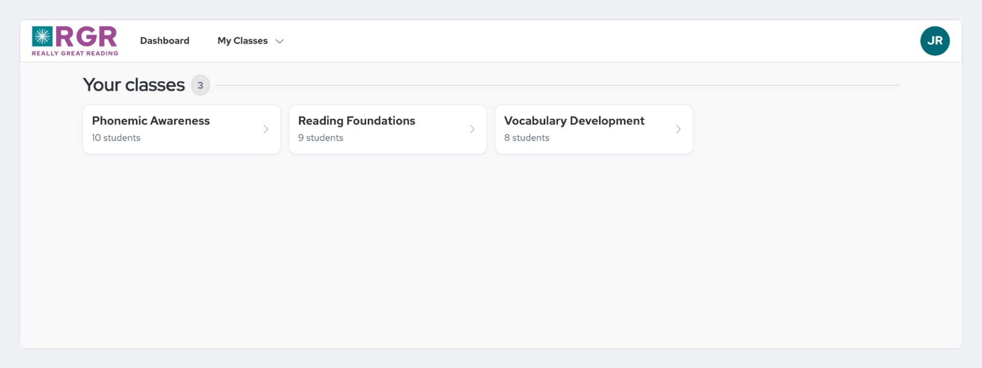
Really Great Reading builds literacy programs for K–12 classrooms. The first version of its 2.0 platform looked like what it was: a basic skeleton. That was a deliberate trade so engineering could focus on the platform underneath. But the interface is often the first proof of quality a district sees.
Problem
The placeholder UI had no 2.0 branding and no distinction between teacher and student experiences. Our product brief put the risk plainly: visual presentation drives confidence and perceived quality, and an undifferentiated UI was eroding trust.
The market made the gap clear. One teacher wrote online that a major competitor's interface "reminds me of a 90s game." Polish and trust were open territory.
The work came with firm constraints:
Restyle, not relayout – Scope was color, typography, spacing tokens, and core components. New layouts, IA, and workflows were out.
Three environments – The look had to work on the teacher dashboard, a projected presentation view, and the student dashboard.
Different grade bands – Young students needed an age-appropriate design. Older students wanted a mature interface, not a "baby" app.
Accessibility – Every direction had to leave headroom for WCAG AA.
The Challenge
How might we give RGR 2.0 a visual direction that teachers trust at first glance, without rebuilding a single layout?
Approach
Four Directions, One Dashboard
I rendered the same teacher dashboard four ways. Layout, content, and information architecture stayed identical so that only the visual treatment varied:
Spacious – Calm and instructional, with generous whitespace.
Playful – Warm and energetic, with rounded shapes and bolder type.
Editorial – Premium and content-forward, with large display type and hairline rules.
Dense – Information-rich, with a tight grid and smaller type.
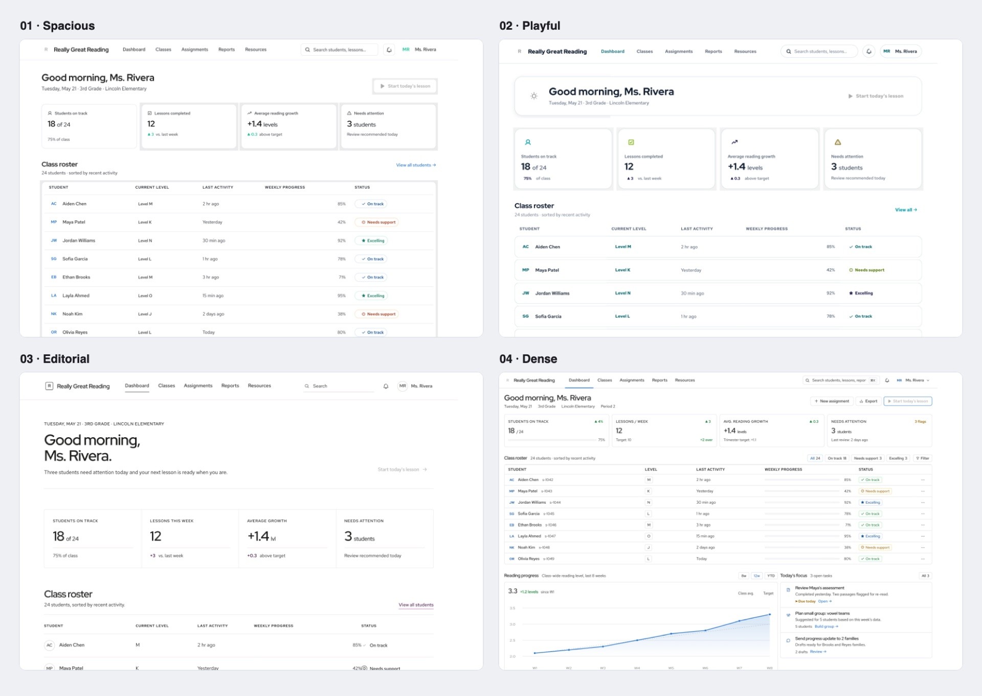
Each direction shipped with live controls for density, palette, and curvature, so stakeholders could audition variants without leaving the page. I scored every direction against four criteria: fit with our "less is more" principle, fit with the teacher persona, how well it scaled to other surfaces, and accessibility headroom.
In the May 2026 stakeholder review I recommended Spacious as the base. I folded in Playful's warmth, kept Editorial in reserve as the runner-up, and set Dense aside for future admin and reporting views, so nothing useful was thrown away.
Iterating in the Browser
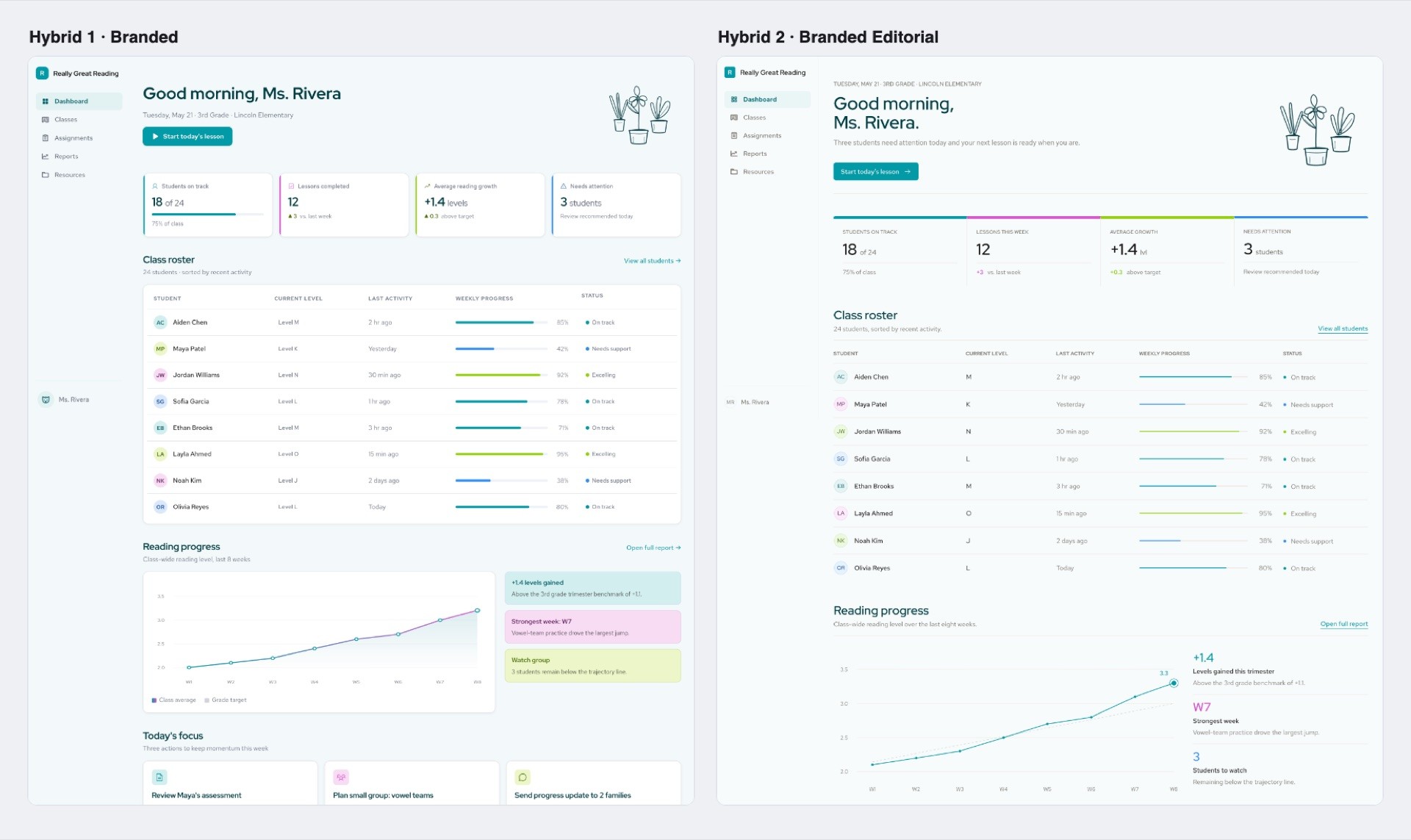
Later rounds moved out of static mockups and into HTML prototypes. I built two branded hybrids that brought RGR's brand colors into the dashboard, and a full-color immersive concept that wrapped a light working canvas in a deep teal or purple shell. Reviewing real pages in a real browser kept the conversation on how the product would actually feel.
Testing with Teachers
A stakeholder preference is a starting point, not a verdict. In July 2026, our UX researcher and I put four concepts in front of 61 teachers in an unmoderated think-aloud test on UXtweak: 34 who did not use RGR and 27 who did. The group included 30 grade level and subject teachers, 14 special education teachers, and 12 intervention teachers.
Each session followed the same structure:
5-second exposure – Teachers saw one concept for exactly five seconds, capturing a gut-level first impression.
Nine rating scales – From memory, they rated likability plus eight paired opposites, such as Cheap vs. Premium and Confusing vs. Clearly Structured, mapped to our five design principles.
Reflective ranking – After seeing all four in randomized order, they compared them side by side and ranked them.
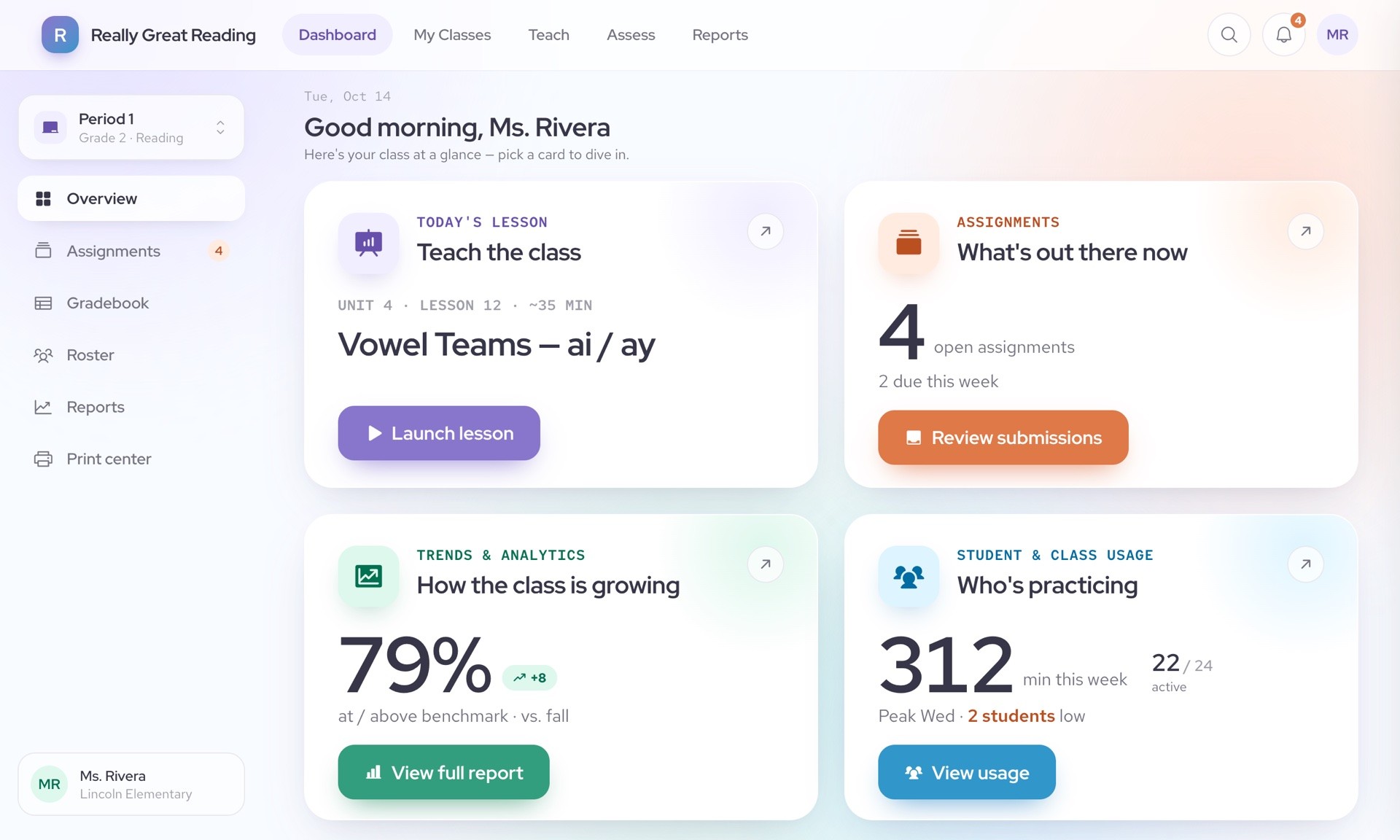
Four themes explained why the winning concept worked:
Sectioned layout drove action – Teachers felt the quadrant layout reduced their legwork, which made them want to click in and act.
Clear organization read as premium – Labels and structure lowered cognitive load.
Color coding aided scanning – Different sections in different colors helped teachers find what they needed quickly.
Familiar navigation and personal warmth built trust – Teachers singled out the greeting at the top of the dashboard.
It looked premium... clean, organized, which I know as a teacher for me, I need that... you might pay a little extra for that.
I really, really like Concept D... it's so clearly labeled. I love the color coding. I just think you gained so much info from that one page.
From Concept to System
A winning concept is not yet a design system. To turn it into one, I built a decision board: nine rounds, each showing the same real screen with one thing changed. The rounds covered page background, card style, primary and secondary color, navigation bar, tabs, sidebar, buttons, tables, and type scale.

Every round had a criterion written for the classroom, such as "can a teacher track one student across a row while a class watches?" The team looked in silence, discussed, and clicked a winner, and the board logged each decision. Tiebreakers were agreed up front:
Chromebook screens and projection legibility beat personal preference.
WCAG AA is a floor, not a vote.
Whatever costs engineering less wins a genuine tie.
The board also named the hardest tension first: the tested design used soft pastel accents, while the brand colors were locked to teal and magenta. The color rounds existed to resolve that conflict rather than avoid it.
Output
The result is a differentiated design system for RGR 2.0, with distinct treatments for teachers and students built on shared foundations:
A teacher dashboard that is calm and professional, with clear sections and color coding for quick scanning.
A presentation view that stays readable when projected to a whole class.
Student dashboards tuned by grade band.
Because the scope was limited to theme tokens and core components such as buttons, inputs, cards, alerts, and navigation states, the direction translated directly into a system engineering could build against. The design system shipped in Storybook.
Outcome
Ranked 1st in Every Teacher Segment
The winning concept took first place overall, with grade level and subject teachers, and with intervention and special education teachers. A second concept was a clear runner-up, and the other two tied for last.
6.0 out of 7 Likability
It earned the highest likability score of the four concepts after only five seconds of exposure. Teachers also rated it 6.3 out of 7 for looking professional.
The win was not a clean sweep on every scale. Intervention and special education teachers rated the data-forward runner-up as more useful for their work, and they flagged a risk nobody had planned for: sensitive student scores showing up on a projected screen. That finding started a dedicated persona effort for 6th to 8th grade intervention and special education teachers.
Key Takeaways
What I Learned
Evidence beats taste – Testing turned a debate about preference into a decision backed by data.
First impressions are measurable – A 5-second exposure captures the same snap judgment a district buyer forms.
Change one thing at a time – Isolating a single variable per round made design system decisions fast and easy to defend.
What I'd Do Differently
Recruit specialists as their own segment – Intervention and special education teachers evaluated everything through a stricter lens. I would plan for that from the start.
Test a student screen earlier – Every concept was teacher-side, which delayed grade-band decisions like the type scale.
Set up measurement sooner – Track the brief's trust and accessibility targets as soon as restyled screens reach teachers.
Final Thoughts
This project reinforced that visual polish is not decoration. For a platform teachers and districts have to trust, the look is part of the product, and putting it in front of 61 teachers made the decision easy to defend.